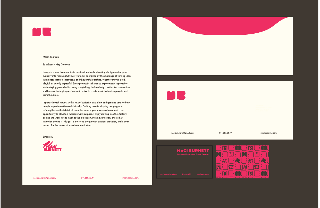
Maci Burnett | Graphic Design
Project Statement

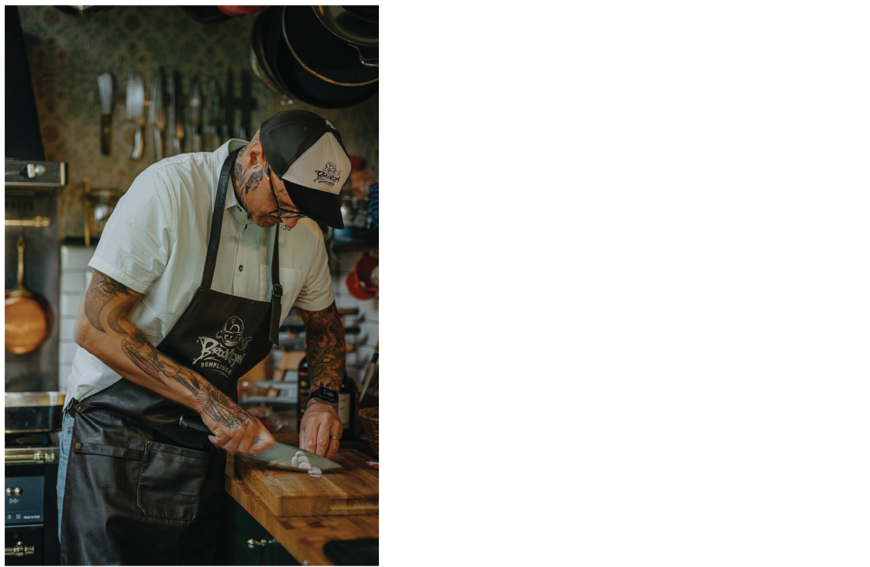
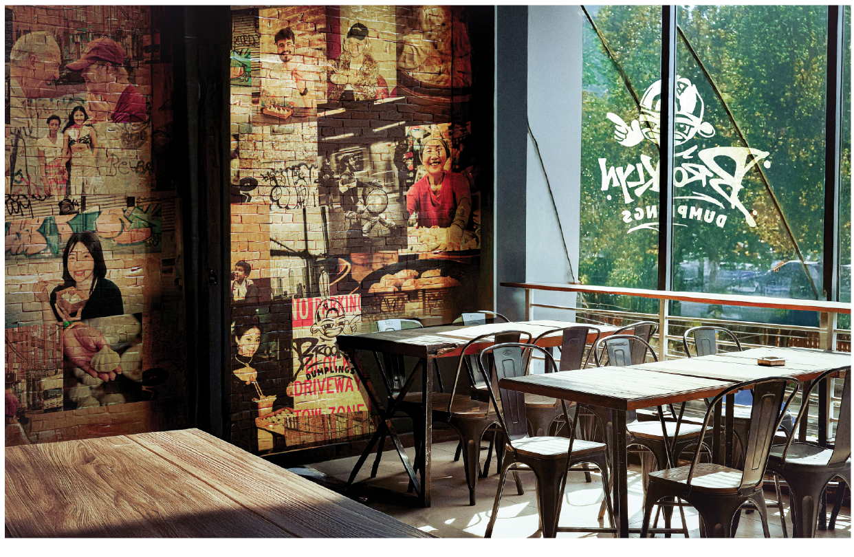
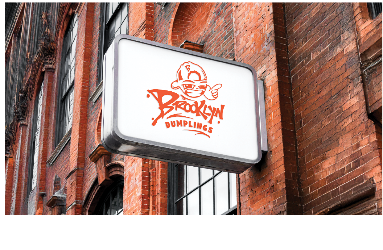
Brooklyn Dumplings Branding System
Brooklyn Dumplings was created to transform a fast‑casual takeout concept into a vivid cultural statement that celebrates the collision of Asian cuisine and traditional American meals. Surrounded by predictable minimalist identities in the quick‑serve landscape, the challenge was to build a visual system that captures the rebellious personality of the brand while maintaining cohesion and real functional versatility. The concept focuses on expressing the urban personality through contrast, hand‑drawn illustration with custom typography and a food inspired color palette that reflects the vibrancy of city life and the fused menu items. Instead of relying on traditional food familiarity, the identity uses energetic line work, graffiti‑inspired lettering, and expressive mascot forms to communicate attitude through its visual presence. This approach allows the system to visually communicate spontaneous intentionality, allowing each element a sense of movement and individuality. The solution emerged through a collection of adaptable marks and patterns that work conceptually across signage, packaging, interiors, and digital implications, creating a unified experience that feels handcrafted and streetwise. The interplay between structured components and sketch‑based artwork reinforces the brand’s voice as both contemporary and rooted in cultural storytelling, while the high‑contrast color palette enhances visibility in dense urban spaces and supports strong product differentiation. The identity thrives on flexibility, offering multiple character narrative and pattern applications that maintain consistency without restricting creative expression. This modularity ensures that every encounter with the brand feels lively and immersive, from a storefront sign glowing against brick exterior to a dumpling box handed across a takeout counter. The system communicates a distinct attitude of confidence, and cultural fusion, inviting audiences to engage with a brand that values flavor as much as personality. Brooklyn Dumplings positions itself as a fresh voice in modern takeout culture, transforming a simple culinary offering into a dynamic urban experience that celebrates creativity, community, and the spirit of Brooklyn. Developing this identity also reinforced the importance of building a strong brand architecture grounded in research. Understanding the competitive landscape revealed how many fast‑casual concepts rely on visual familiarity rather than bold differentiation, which opened opportunities for Brooklyn Dumplings to carve out a more memorable space. By studying audience behaviors, cultural references, and regional design cues, the system became not only expressive but strategically informed. This process highlighted how a cohesive branding framework can provide clarity while still allowing for experimentation, ultimately giving the brand a competitive edge. The final identity demonstrates how research‑driven decisions and creative risk‑taking can work together to cultivate a brand presence that feels both intentional and unique.
Selection of Work: