CJ Kaltwasser | Graphic Design
Project Statement

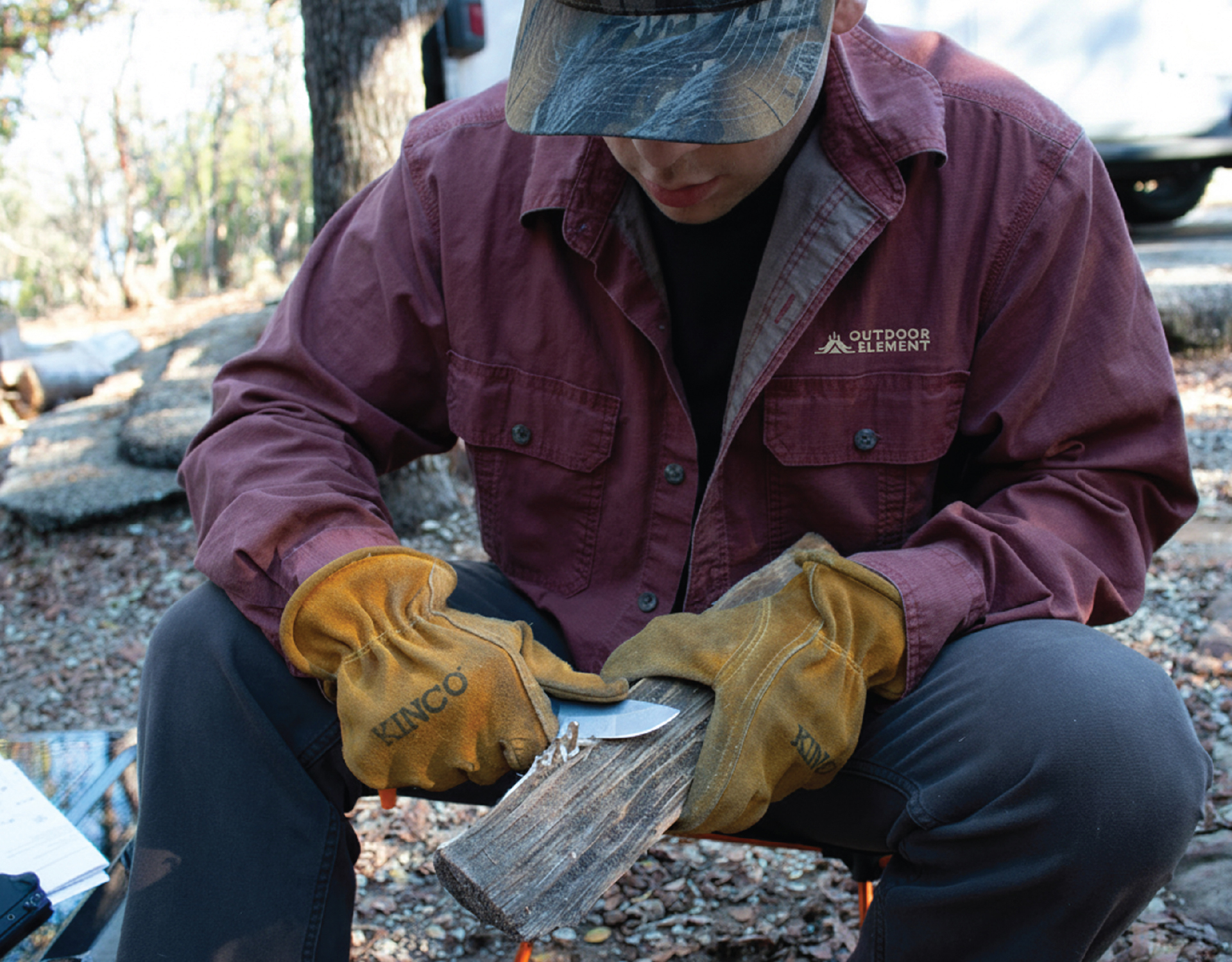
The goal of this project was to rebrand Outdoor Element, an outdoor gear company in Colorado that specializes in creating tools for people who love tested practicality and function. I wanted to transform Outdoor Element into a brand that clearly communicates its heritage, reliability, and readiness in the outdoors.
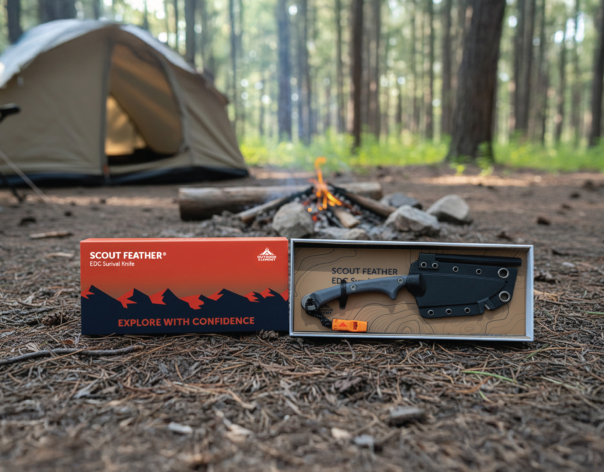
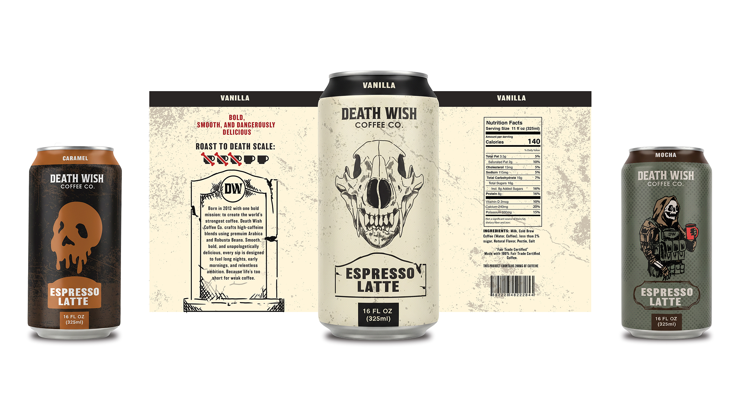
This rebranding needed to give Outdoor Element a visual identity that stands on its own: cohesive, recognizable, and approachable for any lover of the outdoors. There were several problems with the original system. When comparing them to competitors with stronger systems, Outdoor Element’s identity was not clear and distinct enough across its products and platforms. For example, the original packaging designs were too cluttered with information, logos, and type. Additionally, the company’s heritage and mission were not clearly communicated through the logo mark alone, which is an important aspect of a branding system.
The main approach revolved around bringing in ties to the founder, Mike Mojica’s heritage and deep connection to the Laguna Tribe and Pueblo Nation, emphasizing elements such as the New Mexico sun motif, and the colors and landscape of Colorado. The red-orange highlight color represents the setting or rising sun, as well as the landscapes and textiles found in New Mexico. I chose a dark blue for the base color to allude to the darkness of the sky, deep waters, and distant mountains of Colorado.
For the typographic approach, I started with Gill Sans and customized it to better align with the brand. By rounding the corners and edges of the letterforms and adjusting the spacing to match the sun mark, the logo and wordmark turned into one cohesive entity. For the supporting typefaces, I chose Museo Sans and Museo Sans Rounded to communicate the same rounded features from the logo. On the packaging designs, I took inspiration from the existing gradients and mountains and applied my style and colors to match the new identity. I also simplified the information on the packaging, only putting the necessary content and adding more hierarchy between the logo, names, and descriptions of the product.
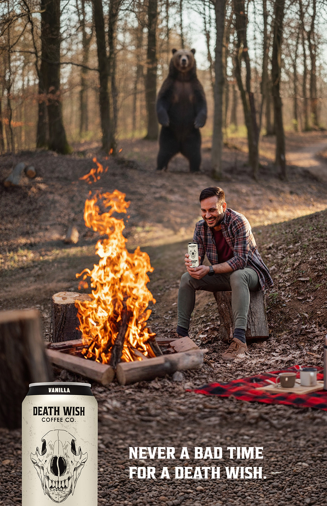
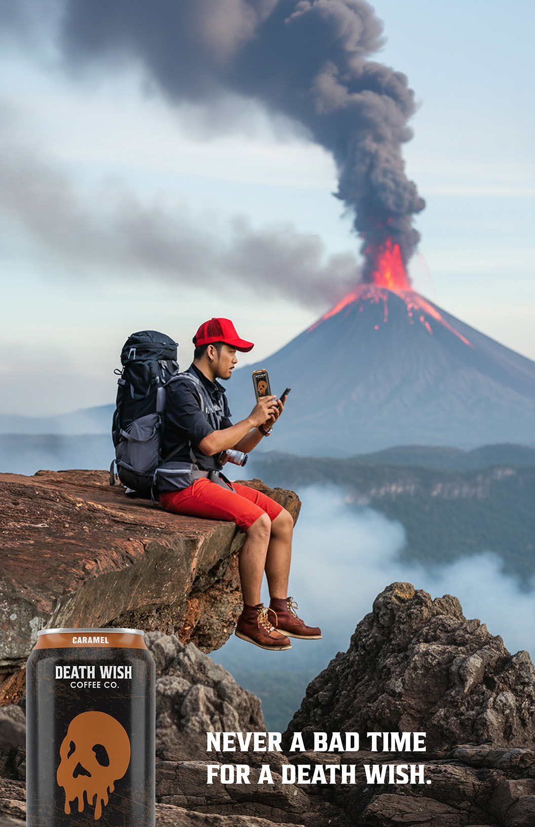
The result is a cohesive and distinctive identity that brings new life and clarity to Outdoor Element, allowing the brand to stand confidently across different products and platforms. It not only strengthens shelf presence and recognition, but also better communicates the company’s heritage, purpose, and commitment to creating practical tools for every outdoor lover.
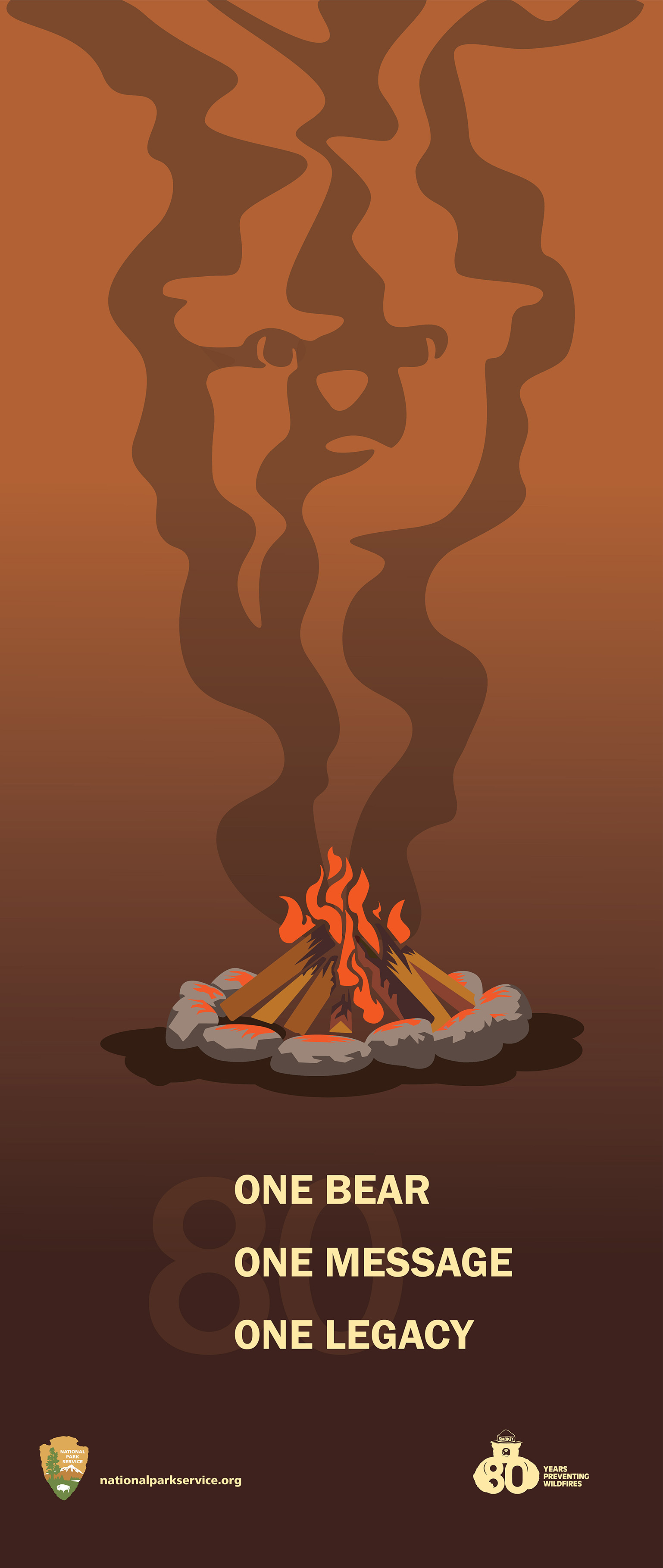
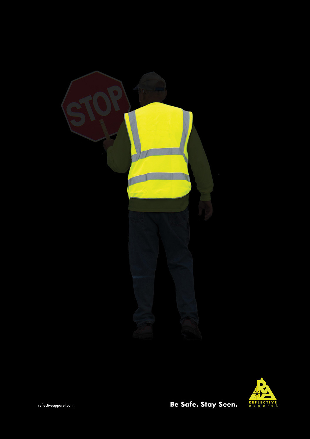
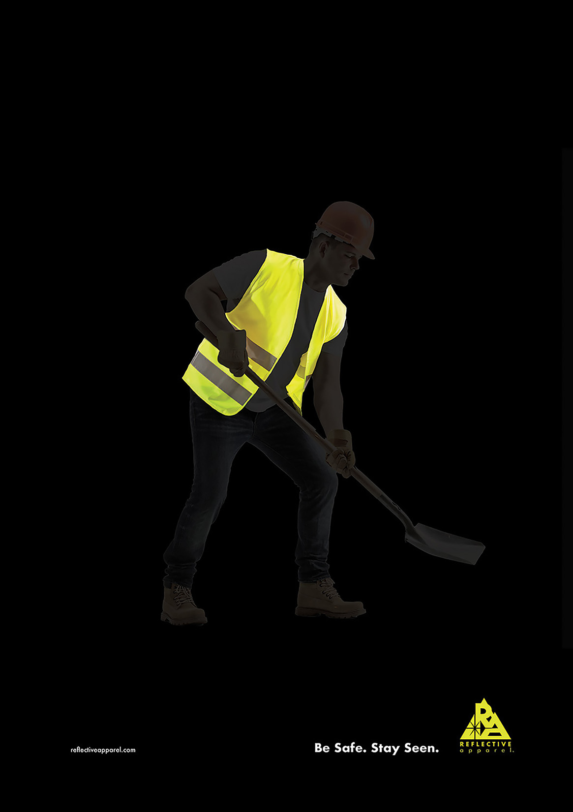
Selection of Work: