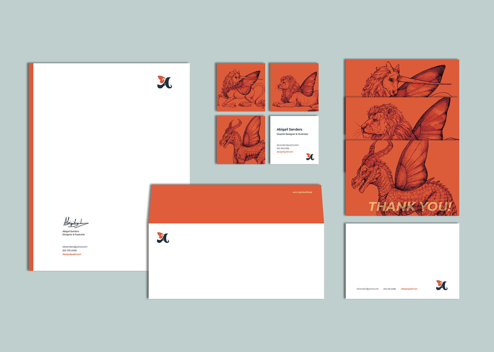
Abigail Sanders | Graphic Design
Project Statement

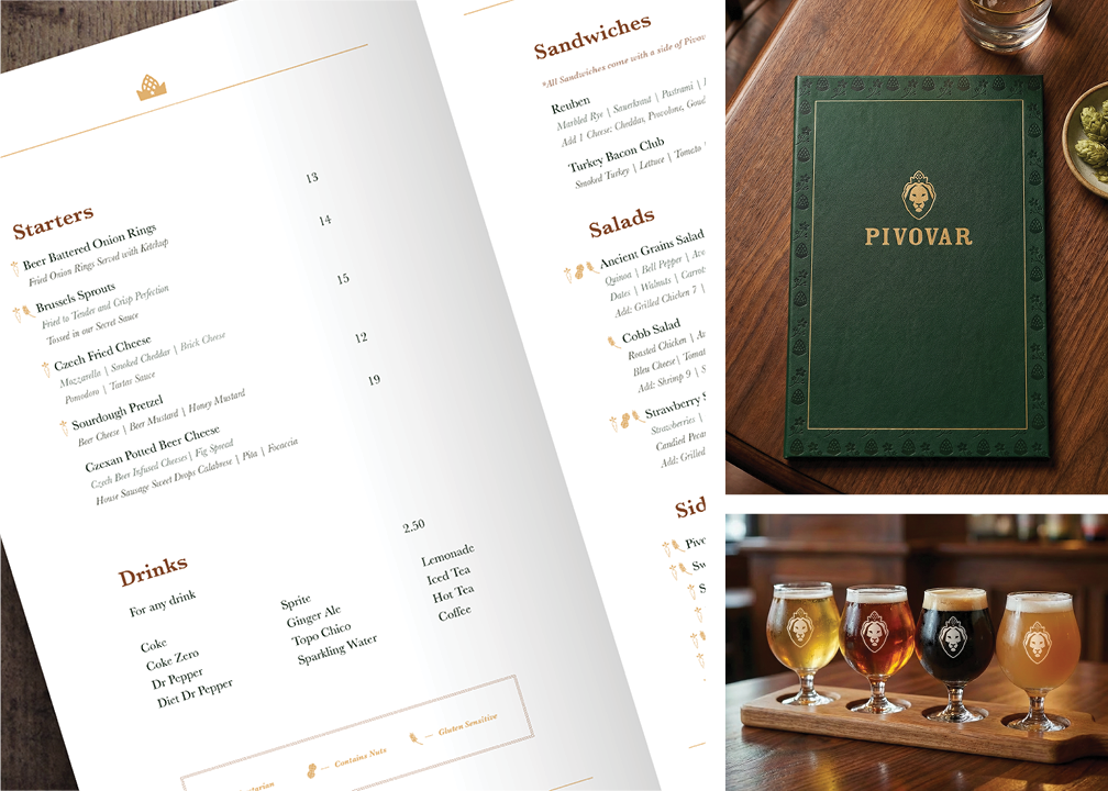
Pivovar is a Czech-inspired luxury boutique hotel, restaurant, and brewery located in Waco, TX. Established in 2021, Pivovar resides in a refurbished historical building that was once called, "New Katy Hotel”, next door to the famous Magnolia Silos. The love for Texas and Czech heritage inspired Pivovar to provide a unique, one-of-a-kind, and adventurous experience though their fusion flavors, traditional Czech beers, and immersive environment. The goal of this project was to redesign a brand identity that effectively embodies Pivovar’s essential traits: cultural pride, luxury, tradition, and community. The identity branding incorporates elements that reflect culture with a sophisticated and contemporary aesthetic. The primary brandmark was designed through a morphological approach of a lion (the national animal of the Czech Republic) wearing a special head piece consisting of a crown, a hop, and the Texas Lone Star. Secondary brandmarks consist of the logotype, ‘Pivovar’, with the Lone Star as the dot of the ‘i’, the ‘P’ in ‘Pivovar”, the hop crown, and the Lone Star itself. The logotype’s typeface is a slightly modified version of Rosewood Std Fl, and it was chosen for its vintage, bold, and impactful character. Five brand colors were carefully selected to reflect the colors of hop plants, beer foam, and copper silos in Pivovar’s brewery. The five colors are – dark green, forest green, light creme, wheat-colored gold, and rusty sienna brown. The green tones act as the primary colors for the restaurant and hotel area, whereas the bathroom and beer spa are primarily the creme and copper tones. Together, the color palette achieves to embody a sense of richness, sophistication, and old-world charm. The typeface families that were selected for the brand were Baskerville and Helvetica. Baskerville is the most prevalent of the two. It has a familiar, classic, and traditional quality that reflects Pivovar’s personality. Helvetica was chosen for its readability, simplicity, and compatibility with Baskerville due to its similar x-heights and letter width. The proposed patterns, Stars and Pivovars and Aromatic Notes, were designed to reflect Pivovar’s pride and extravagance. Additional mockups that represent Pivovar’s vast services were created with strategic AI prompting to bring the brand elements to life. The proposed brand identity achieves a greater sense of cultural pride, historical roots with contemporary influence, and creates a visually engaging and timeless aesthetic.
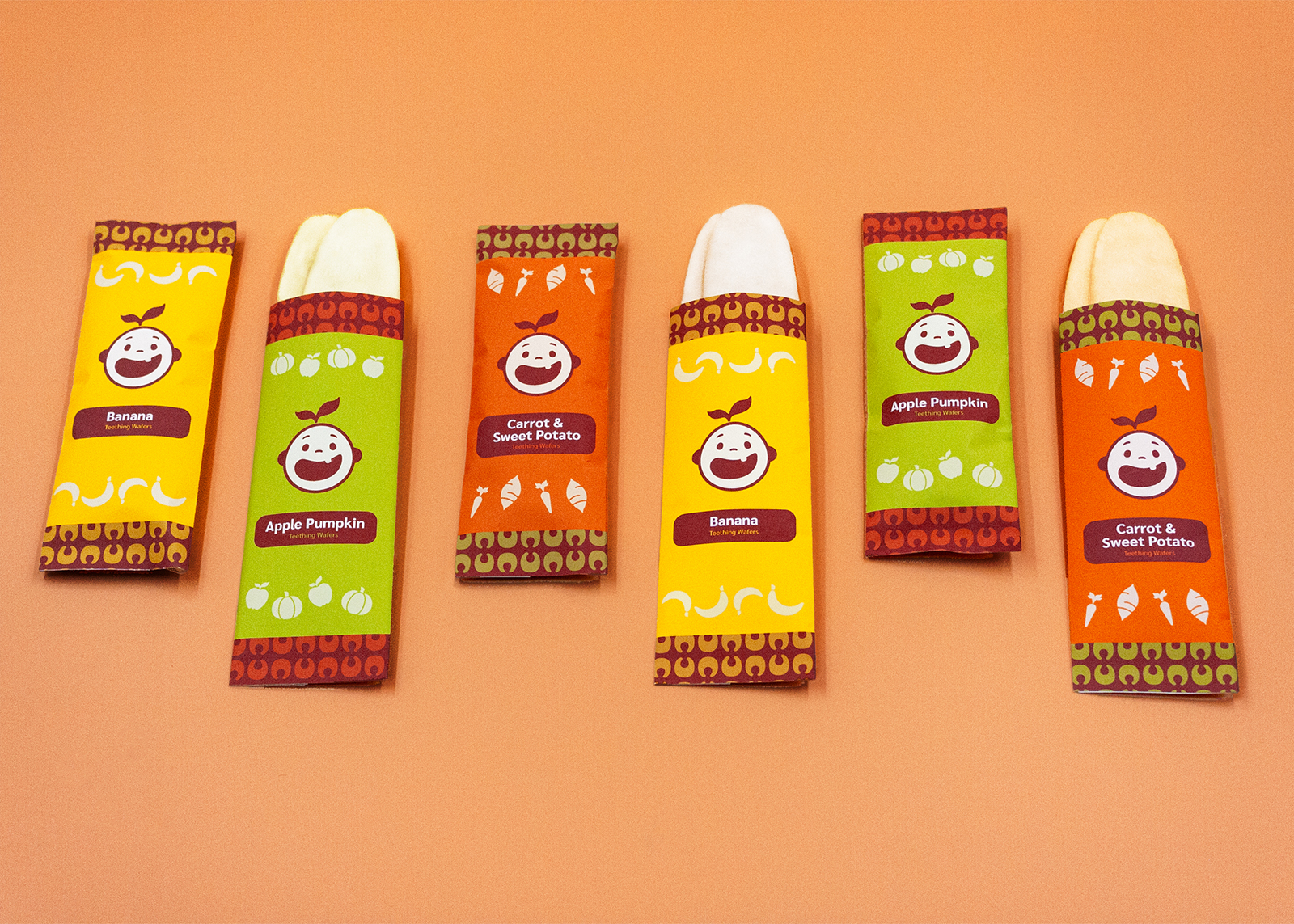
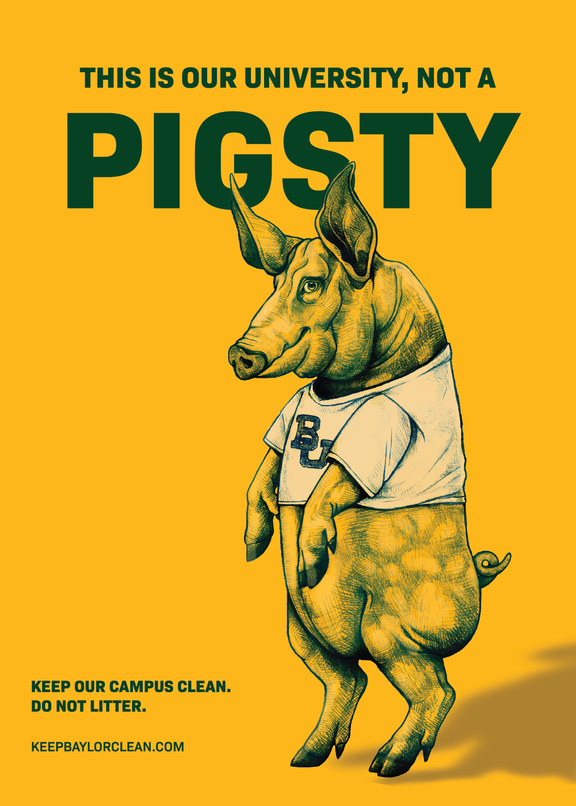
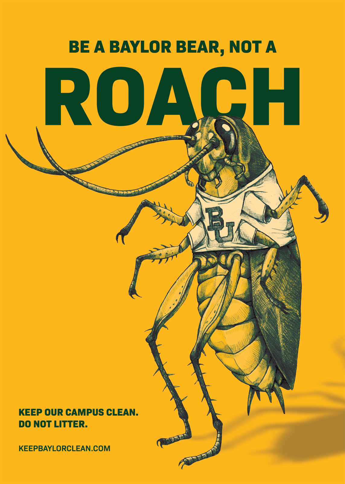
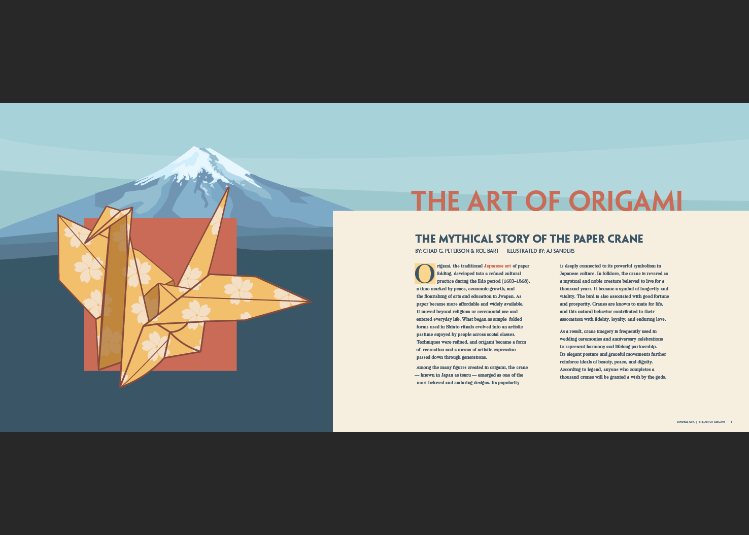
Selection of Work: